


“Do! Judge A Book By Its Cover” is a semi-regular feature on Pop! Goes The Reader inspired by Katie’s feature Cover Love on her blog One Page At A Time. The idea is being used with her gracious permission.
I think we’re all familiar with the age-old adage “Don’t judge a book by its cover”. And you know what I have to say about that? Rubbish! Covers are an invaluable part of a book’s package. A truly great cover can tell you a lot about the novel contained within its pages. Book covers can also catch your attention and attract you to a novel you might otherwise ignore. So go ahead, judge a book by its cover – We all do it!
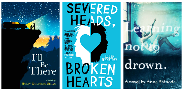
For the eighth instalment of Do! Judge A Book By Its Cover, I’ve decided to re-visit the contemporary genre! Because it’s my favourite genre of all and the one I’m most familiar with, there is a seemingly endless series of covers that I adore and want to highlight but the selection is so vast I’ve been forced to split them into a number of different entries. This time around I tried to focus more heavily on illustrated covers as that’s the style I tend to prefer on book covers of all genres. That said, I’m also particularly taken with the cover for Learning Not To Drown, which I find both beautiful and chilling.


Now it’s your turn! What are some of your favourite contemporary covers? Did I list one of your favourites here or is there one I forgot that just has to be included? Let me know in the comments!


14 Responses
I noticed that a lot of these contemporary covers are foreign editions or paperbacks! The foreign editions are definitely more graphic and less photographic, but I like it all the same. I especially love The Probability of Miracles and Attachments. Beautiful post as always, Jen!
Jen recently posted…Stacking the Shelves (#11)
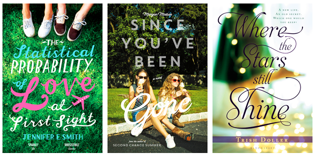
Thank you, Jen! I’m so pleased that you noticed – I definitely tried to branch out a little more with this edition as there are many times when I prefer the foreign or alternate editions of book covers over their mainstream counterparts. 😀 I think the alternate cover for The Statistical Probability of Love at First Sight is the perfect example of this. I adore both of the ones I included in this week’s post!
Jen @ Pop! Goes The Reader recently posted…Waiting On…Tsarina by J. Nelle Patrick
You picked some beautiful covers and also from other edtions which I really love!
Take “Severed Heads Broken Hearts” I love this cover so much better than the US yellow version “The Beginning of Everything”.
My favorite Contemporary cover might be Meant To Be – I loved the book, but I also love the cover so so much!
And when it goes to only photographic covers, CRASH INTO YOU – LOVE it, has a interesting angle and love the colors!
DannyBookworm recently posted…Sinister and Spooky! – Unbreakable by Kami Garcia – The Legion #1
Thank you so much, Danny 😀 I really appreciate your comments on these posts every week *Hugs*
I also prefer the cover for Severed Heads Broken Hearts in this edition over the U.S version! Granted, I do tend to gravitate toward covers that feature the colour blue generally, but I prefer the illustrations and overall design much more as well.
I like the cover for Meant To Be in theory, but it has always bothered me that the image of the couple is a little too dark. I love the rainbow-coloured burst behind them, but I always found the image of the couple a little muddy. Otherwise, it’s perfect!
Jen @ Pop! Goes The Reader recently posted…Waiting On…Tsarina by J. Nelle Patrick
So much gorgeousness. ;D
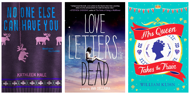
It’s really hard to pick the ways that are my favorites, but I think I love the ones that doesn’t use an photographic image for the covers. I feel myself drawn to them, specifically Vaclav & Lena and No One Else Can Have You. And the different typefaces make me squeal in joy.
I tend to prefer illustrated or typography-centered covers over photographic ones as well! I find them far more creative and eye-catching 😀 That said, sometimes a combination of the two can be quite lovely, as in the case of Jessi Kirby’s Golden!
Jen @ Pop! Goes The Reader recently posted…Waiting On…Tsarina by J. Nelle Patrick
I know a lot of these books, but I haven’t seen most of these covers! I’m not really an illustrated cover girl, but I do think that the talent that goes into the creation is amazing. Many illustrated covers are simple, but the placement of objects and color choices have to be just right to be able to pull off a well-done illustrated cover. I think the cover for The Probability of Miracles is gorgeous, as is the Eleanor and Park one.
I like covers similar to that of Love Letters to the Dead. I’m a big fan of different typefaces and basically anything that involves the sky (I have a weird obsession with sunsets/dusk/sunrises).
Btw, I love these posts!
Rachel recently posted…Review: This is What Happy Looks Like by Jennifer E. Smith
I’m so glad you enjoy them, Rachel – Thank you! They’re so much fun to put together each week but sometimes I worry other people aren’t as interested in cover art as I am 🙂 It’s a relief to hear otherwise!
Jen @ Pop! Goes The Reader recently posted…Waiting On…Tsarina by J. Nelle Patrick
Wow, you’ve found a lot of good ones! I absolutely LOVE the Vaclav & Lena one — that ampersand! <3
Kelley (Another Novel Read) recently posted…The 7 Deadly Sins of Reading
Thanks, Kelley! I fell in love with the cover for Vaclav & Lena the instant I saw it. There was another cover I also liked for that novel but I couldn’t seem to work it into this week’s post. Hopefully another time! It was illustrated as well, although a little more simple and staid 🙂
Jen @ Pop! Goes The Reader recently posted…Waiting On…Tsarina by J. Nelle Patrick
The Statistical Probability of Love at First Sight has some super cute cover designs! I need more of these contemporaries on my shelf to brighten them up 🙂
Helen @ My Novel Opinion recently posted…Top Ten Tuesday: Books at the top of my Fall TBR
I couldn’t agree more, Helen! They’re all special in their own way 🙂 Jennifer E. Smith seems to have generally lucked out with the cover designs for all of her novels.
Jen @ Pop! Goes The Reader recently posted…Waiting On…Tsarina by J. Nelle Patrick
I really LOVE these covers, and I’m particularly pleased that you included the international covers for so many of these. I wish it was easier/cheaper to purchase copies from overseas – I prefer those covers in many cases!
Hannah @ So Obsessed With recently posted…Read. Review. Rate?
I couldn’t agree more, Hannah! I think this is particularly true in the case of Rainbow Rowell’s covers – I would own one version of each if I could! I thought the numerous covers for The Statistical Probability of Love At First Sight were particularly lovely as well, and made me want to read the book all the more 😀
Jen @ Pop! Goes The Reader recently posted…Do! Judge A Book By Its Cover – Issue Nine: Fantasy